HeatMapster
Turn spreadsheet data into heatmaps on Windows. Compare results, find patterns and share clear visuals in reports and presentations.
For Windows 10 and Windows 11 · 64-bit PC
See current price and license terms in Microsoft Store.
Choose the view that answers your question
Start with a ready-made matrix or a table of individual records. HeatMapster includes tools for these different kinds of analysis.
Summarize records
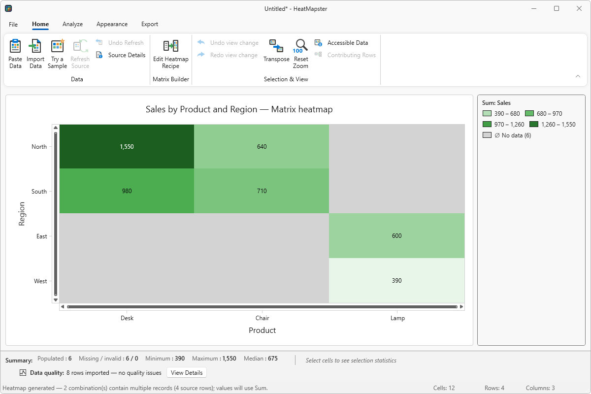
Use Matrix Builder to group sales, measurements or other records by two categories. Choose the values and calculation, then review the resulting matrix.
Compare actual and expected
Compare current values with a baseline using differences, percentage changes or ratios. Keep missing and undefined results distinct from a genuine zero.
Explore relationships
Create Pearson or Spearman correlation matrices from numeric variables. See positive and negative relationships without treating correlation as proof of cause.
Find patterns over time
Use Time & Calendar views to group dated records into weekday, hour, month and other time layouts. Count events or summarize a numeric measure.
Review classification results
Build a confusion matrix from actual and predicted classes. Inspect counts, normalized values and classification metrics to see where predictions differ.
Compare groups consistently
Use Split By to create separate heatmaps for categories such as region or team. Choose shared scales when you need to compare their colors directly.
From spreadsheet to a useful visual
1. Bring in your data
Import Excel workbooks, CSV and other delimited text files, or paste a table from the clipboard. Review headers, types and the selected worksheet or range.
2. Check the meaning
Choose the analysis and inspect its preview. Set titles, labels, number formats and a color scale that communicates the result, including missing data.
3. Save and share
Save your project for later editing. Export an image, PDF, Excel workbook or PowerPoint presentation, or copy an image into a report.
Your datasets are processed locally on your PC. Application analytics and crash diagnostics are described separately in the privacy policy.
Start with a result you can check
These small examples use the same synthetic data as the application’s built-in samples.
Sales by region and product
Turn eight transaction records into a 4 × 3 matrix. See why two North–Desk records give a sum of 1550, and why an empty combination is not zero.
Actual versus budget
Compare 520 with a budget of 500. Follow the same example through a difference of 20, a percentage change of 4% and a ratio of 1.04.
Prepare the right format for your audience
Reports and presentations
Export PNG or JPEG for everyday documents, SVG for a scalable graphic, PDF for print, or PowerPoint for slides. Review the output size and layout before sharing.
Further work in Excel
Export numeric values with either the heatmap’s appearance or an editable Excel color scale. Save a HeatMapster project to retain the analysis and its source data.