HeatMapster tutorials
Build a sales heatmap, compare actual results with a budget and export a readable result. Start with small examples whose values you can verify.
ZIP with three CSV files and a README. The data is synthetic and is also available in the app’s built-in samples.
Choose the right import
A matrix and a table of records need different treatment. A matrix already has a value at each row-and-column intersection. A raw table contains records that must first be grouped or analyzed.
- Extract the downloaded ZIP. Open Import in HeatMapster and choose one of its CSV files. You can also import an Excel workbook or paste tabular data.
- Check the preview: headers should be recognized, text labels should stay text and the values used for calculations should be numeric. For an Excel workbook, check the worksheet and range.
- Use Matrix for the ready-made matrix example. Use Raw Table for Sales or Actual/Budget, then choose the analysis described below.
Do not use a cropped preview as proof that an entire source is valid. Review the import validation and any reported missing or invalid values before building your heatmap. The application’s Help and context-sensitive F1 explain the available options.
Build a sales heatmap
The Sales example contains eight records with Product, Region and Sales fields. Two records describe Desk sales in North: 1200 and 350. The question is: how much was sold for each region-and-product combination?
- Import the Sales CSV as a Raw Table, or open the built-in Sales sample.
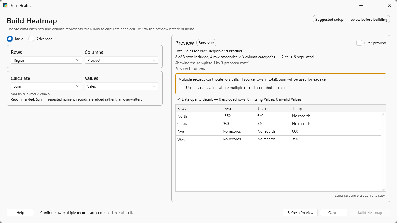
- Open Matrix Builder. In its Basic view, select Rows: Region, Columns: Product, Values: Sales and Calculate: Sum.
- Review the preview. It should contain four regions and three products. North–Desk should be 1550, because 1200 + 350 = 1550.
- Read and acknowledge the preview review prompt, then choose Build Heatmap.
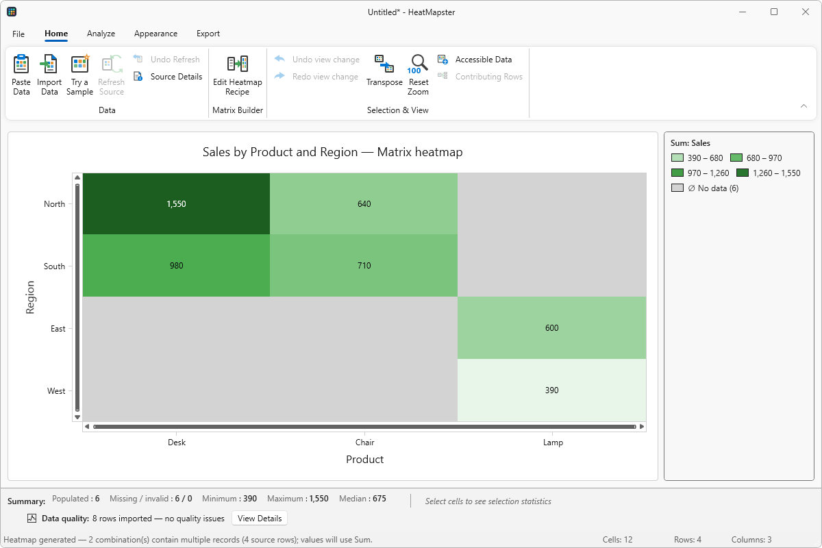
- Give the result a useful title and keep the missing-data indicator visible. Check the legend before interpreting the colors.
| Region | Desk | Chair | Lamp |
|---|---|---|---|
| North | 1550 | 640 | No records |
| South | 980 | 710 | No records |
| East | No records | No records | 600 |
| West | No records | No records | 390 |
The six populated cells add up to 4870. The other six combinations have no records; they are not recorded sales of zero. HeatMapster displays these separately so a missing observation does not imply a low result.
What changes if you choose Average or Count?
For North–Desk, Average gives 775: (1200 + 350) ÷ 2. Counting those source records gives 2. Choose the calculation to match the question; changing the palette cannot turn an average into a total.
Compare separate groups
When your source includes another category, such as year or team, use Split By to build one heatmap per category. A shared color scale makes the same color mean the same value across those maps. Per-map scales can reveal variation within each group, but their colors are not directly comparable.
Compare actual results with budget
The Actual/Budget example has Department, Quarter, Actual and Budget fields. For Operations in Q1, Actual is 520 and Budget is 500.
- Import the Actual/Budget CSV as a Raw Table, or open the corresponding built-in sample.
- Open Compare / Variance. Use Department and Quarter as the row and column categories.
- Select Actual as the current value and Budget as the baseline. Use Sum for this example; there is one source record per department and quarter.
- Choose Difference, review the preview and build the comparison. Operations–Q1 should be 20.
- Try Percentage Change and Ratio, reviewing their labels and neutral values. Operations–Q1 should become 4% and 1.04, respectively.
| Output | Calculation | Result |
|---|---|---|
| Difference | 520 − 500 | 20 |
| Percentage change | (520 − 500) ÷ |500| × 100 | 4% |
| Ratio | 520 ÷ 500 | 1.04 |
For the full Difference matrix, Operations is 20 in Q1 and −20 in Q2; Sales is 60 and −30; Support is 10 and 10. The neutral point is 0 for differences and percentage changes, but 1 for a ratio.
A zero baseline can make percentage change or ratio undefined. Read the N/A indicator and any explicit both-zero convention rather than replacing it with an ordinary zero. A negative baseline also needs careful interpretation; the percentage-change calculation uses its absolute value.
For a period comparison, prepare two value columns or two corresponding matrices. Selecting two periods from a single measure is not a separate automatic workflow.
Choose another analysis
Correlation: which variables move together?
Choose numeric variables for both axes and select Pearson for linear relationships or Spearman for relationships between ranks. Selecting three variables produces a 3 × 3 matrix, regardless of how many observation records support it. A constant variable can produce an undefined correlation. Review missing-value handling and the minimum observation requirement; correlation alone does not establish cause.
Time & Calendar: when do events happen?
Select the date or time field, then a layout such as weekday by hour. Count records when each row represents an event, or select a numeric measure when you need sums or averages. Confirm the week and date-grouping options. These views group the imported timestamps; they do not automatically convert between time zones.
Confusion: where do predictions differ?
Select the actual and predicted class fields. Rows represent actual classes and columns represent predicted classes; diagonal cells are correct classifications. Start with counts, then inspect normalized views and metrics. These tools evaluate supplied predictions; they do not train a model.
Save, filter and refresh
Save a .heatmap project to return to your dataset, analysis and presentation. Use a .heatmaptemplate when you want to reuse the setup with another compatible dataset without including the original data.
Refresh Source is an explicit update that you review. It is useful when the original file changes; it is not a live connection that continuously watches a cloud source.
Source filters affect which records enter the analysis. View filters affect what you see in the result. Neither is a way to remove confidential records from a saved project. Projects may retain the complete imported dataset, and an Excel export that includes raw data can include filtered-out rows. Review the actual file before sharing.
Export for your audience
- PNG or JPEG: a fixed image for a document, email or slide. Check its size and label readability. Copy Image provides a quick clipboard route.
- SVG: a scalable graphic for compatible design and publishing tools.
- PDF: choose a fitted or tiled layout and inspect the preview. Squeezing a large matrix onto one page can make its labels unreadable.
- Excel: choose exact appearance for static cell colors, or an editable Excel color scale for further work. Excel’s native scale can simplify a complex custom palette. Values remain numeric.
- PowerPoint: use a picture for a predictable appearance, editable cells where suitable, or a tiled layout for a large heatmap.
Displayed decimal places change the presentation, not the underlying numeric precision. After exporting, open the file in the application your audience will use and inspect titles, legend, missing-data markers and text size.
Need a specific setting explained? Open Help or press F1 in HeatMapster, read the FAQ, or contact support with the steps and a small synthetic example.